As we’ve learned colors have secret meanings that affect how those viewing them perceive your designs. We’re now moving on to second chapter of our color adventure. Now that we’ve met all the players in “The Secret Life of Colors” series, we are going to learn how these colors affect each other. We will also learn how they work together to create an effective color palette for your design. Let’s start at the beginning of this second color adventure together: Hue, Value, and Intensity.
Hue: The official name for pure colors. These are the colors that you find in a rainbow and appear on the color wheel. Example: the hue of the sky is blue.
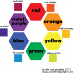
Let’s quickly dissect the color wheel in simple terms. There are three categories of color groupings paint (which is what you learn in elementary school in America), light (on your computer) and printed (usually a professional printing press). To cut the confusion, I’m going to focus on colors in painting.
-Primary Colors, in painting, are Red, Yellow and Blue.
–Secondary Colors, in painting, Orange, Green and Purple
–Tertiary (Third) Colors, in painting, fill in the spaces between the primary and secondary colors. Red-Orange, Yellow-Orange, Yellow-Green, Blue-Green, Blue-Violet (Purple), Red-Violet (Purple)
How HUE affects your designs:
-Each Hue looks different when paired with different colors.
-They can take on different “feelings” depending on how they are paired.
-Hues that look good together are harmonious and we want to view them longer
Value: The amount of gray in a color. This works on a seven-step scale from no gray (white) to a lot of gray (black) added to a color.
Tints have white added to the Hue (pure color)
Shades have black added to the Hue
How VALUE affects your designs:
-Value is one way to define different areas of the design
-Can emphasize or de-emphasize part of the design.
-Create a sense of drama in the design by having large areas of light or dark color
-Create depth in a piece by using darker colors (shades) to create shadows and tints to create highlights.
Intensity: How bright or dull a color is. This is idea is also known as saturation. This is the difference between color and gray. More color is considered bright and less color (and more gray) is considered dull.
How INTENSITY affects your designs:
-Lower intensity images seem dull and more neutral
-Easy way to create contrast is by using grayer (dull) images next to full color (bright) images
-Can focus viewer on one object by lowering intensity of everything surrounding this focal point.

