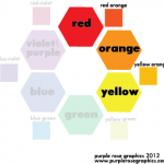
 There are a lot different ways to combine colors into a palette or color scheme. We will only be covering a few of the basic ones. Picking a color scheme for your design is important because people look at items that have a pleasing, harmonious color scheme longer than items that have clashing colors. The first step in all of the methods of picking a color scheme is to first pick a dominant color. Got a color in mind? Great! Let’s start with our first color scheme
Analogous Color Scheme
– Analogous means similar or comparable.
– Uses colors that are near each other on the color wheel
– Easiest way to create a color harmony
-Color scheme that often found in nature
How to Create an Analogous Color Scheme
-Pick a dominant color (gets used the most)
-Choose up to two more colors on each side of the dominant color to go with it
-These colors are a support color (gets used 2nd most often) and an accent color (gets used the least, can be used in combination with blackwhitegraybrown)
