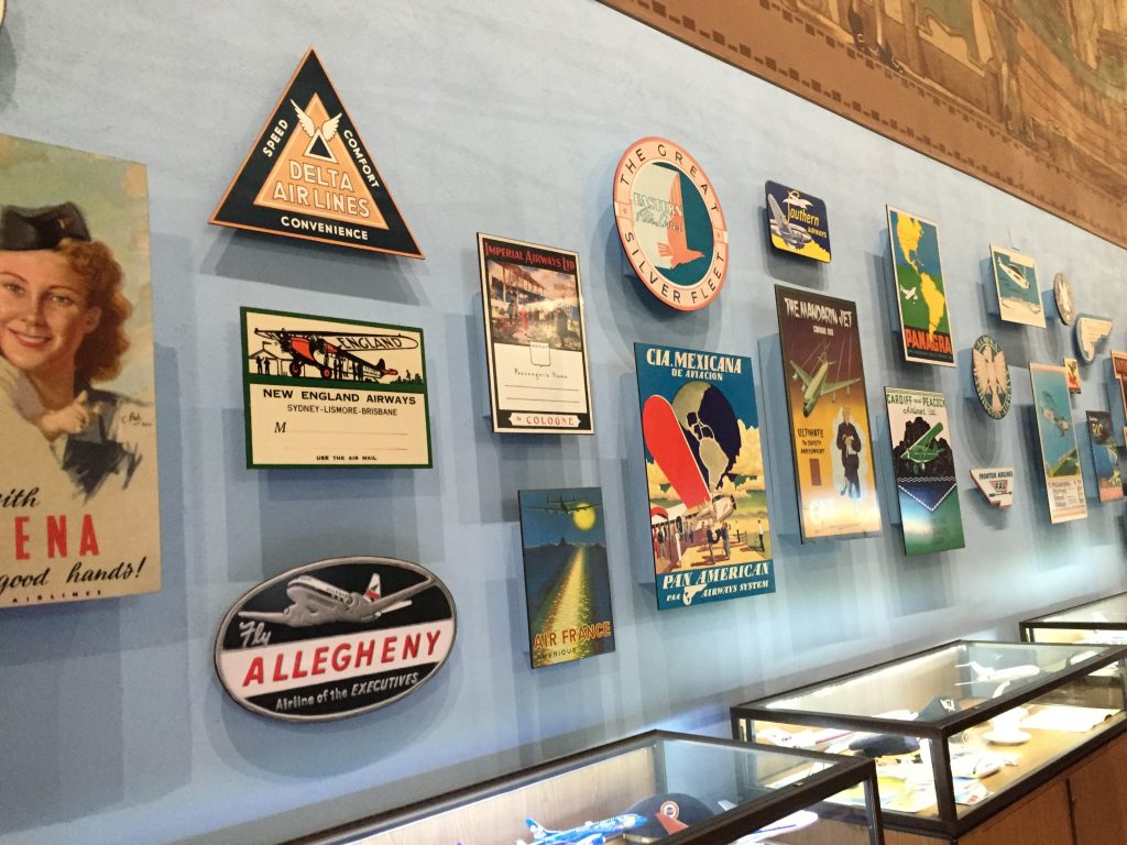
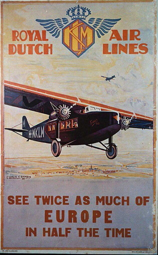
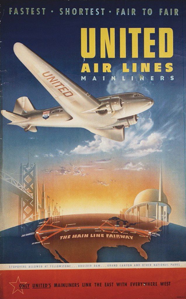
 It’s November already and that means holiday and holiday travels are around the corner. Air travel has made it possible for the average American citizen to be “home for the holidays.” Air Travel in America became popular in the 1950s with the rise of jet planes over air piston planes. The 1950’s also happened to be part of the golden age of advertising when the real “Mad Men” were busy creating now iconic posters for travel companies.
One of the most popular styles of poster was created during this time. That popular style was known as the “International Typographic Style”, also known as the “Swiss Style”. Hallmarks of the Swiss Style are a clean structured layout with bright colors. They usually featured just a few design elements with simple easy to read text and sometimes a slogan or tagline. Another popular style was a version of pop art. Today it could be called “retro style” as this particular type of pop art is a classic style of advertising design from this era. Much like Swiss Style, “Retro Style” also features bold graphic images and very little text. Although it does have more text in some instances than Swiss style.
No matter the style, these posters feature air travel as exotic, exciting, affordable and safe. Air travel used to be a luxury reserved for the wealthy and many people still didn’t believe that it was safe. The posters had a double use, they had to convince people to invest in air travel, but they also had to convince people to use a specific airline when they did travel.
As a graphic designer in Orange County, I design a lot of flyers and posters. So I can tell you that the main job of a poster (even now in the age of social media and smart phones) is to reach out to a business’ target market and convince them that they need a specific brand’s products. Overall, that’s an easier poster to make because you only have one objective. In ve ry simple terms, the marketer and designer isolate the target market and choose the best way to convince this market that they need a specific company’s product over the competition. What the airlines at this time were facing wasn’t just how to fill their flights over their competition, but how to fill flights overall. It’s a two-pronged objective and makes the creation of their marketing and poster advertising that much harder. That’s why a lot of the posters emphasize a certain city or region with the name of the airline in much smaller type.
Even after all the twists and turns travel posters and airline marketing have made over the years, those early days are still looked back on with nostalgia. What made those posters incredible (and something we still want to emulate) is that they achieved a two-pronged objective of creating an industry, and notable brand within that industry, all with just a few hand-drawn graphic elements and very little text. Today they still evoke an emotional response in us, and that is why we keep going back to 1950’s design and the era’s iconic travel posters.
If you’re looking for a graphic designer in Orange County to help you come up with a poster for your business, contact me today for a quote.
