I love working with my clients to create an amazing logo or even full brand visuals for them. The process differs a little for each customer based on what I’m doing for them and their goals. Today I’ll be sharing how I created the logo for Future Music Stars. They provide music and voice lessons for aspiring musicians.
The first step for every new client is a consultation call. These are different than the introduction consultations. Those are to see if working together makes sense, but if it does then the client signs up with me. Once they do, we’ll hop on this call which is longer and more in-depth. For this client, we started with an old logo they had they wanted to replace. We went over what they loved about their old logo and what they wanted to be changed. They loved the colors they had so we kept the palette of bright fun colors including orange, purple, green, yellow, dark aqua blue, and light aqua blue. We also agreed to keep the music symbols and include stars because it’s in their name. They felt the old logo was too corporate and wanted something that was professional, but fun and that would attract their ideal clients who are families.
Next up is my favorite – Research!! I love learning new things, so this is always interesting. Every logo comes with an hour of research built into the price, but I frequently do more than that. When I do research for a logo, I always look at the client’s competition and how my client fits into the marketplace. I want to know what they’re doing so I can avoid accidentally copying someone and stay away from very common styles of logos for that industry. I always look at what industry standards for visuals might be also just in case there are some rules or guidelines that the client and I need to keep in mind during the design process. I also research the industry, especially if I’m not familiar with it.
For Future Music Stars, I did roughly 3 hours of research. I wasn’t super familiar with the music industry or the music education subset of the industry so I spent most of my time educating myself on the industry and familiarizing myself with the equipment used in that industry. I also learned what we were planning was something that was going to stand out because of the color palette, not the icons, but there wasn’t really a way to avoid those symbols as they’re the standard recognized symbols for music.
After all that research, I drew up a few options. Most clients get between 3-5 options to view.
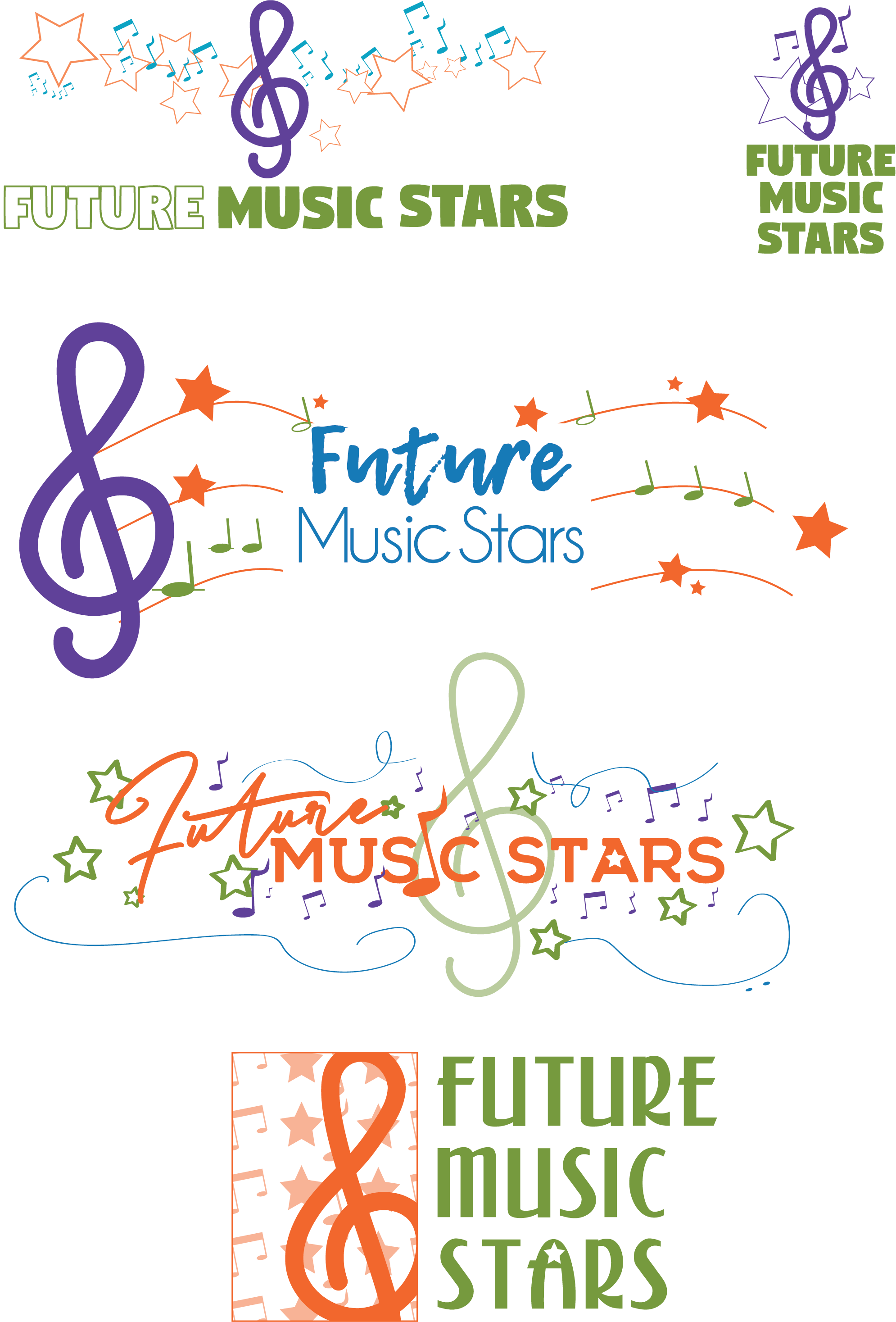
The point of the options is to give the client a few possible directions the logo can go. Sometimes they look similar as they do here, but other times they look very different from each other. The client can then choose which direction they want to go and we can start to refine that option. If the contract also calls for alternate versions which cost extra as this one does then this is when I’ll create the alternate versions. This way we can refine everything at once.
![]()
I always keep the client’s goals in mind as we work together. For this one, the main goals are colorful, family-friendly, fun, and professional. Logos come with between 3-4 rounds of revisions, which is usually enough to get to a point where the logo is ready for approval and for use.
![]()
One of the things I love about this logo is that it is fun. It screams fun and music without being so family-focused that it loses its professionalism. It’s always a blast for me to work with great clients who love collaborating and truly embrace the process because creating a logo from scratch is a process. Plus, I really love kids and family-friendly companies because those are some of the most fun, most creative brands I can help work on.
As an update, the alternate logo appears on the client’s Facebook page, while the full logo, which appears above, enjoys appearing on their printed communication like student’s certificates of completion and flyers for their recitals. They loved working together so much that they’ve been back to work with me twice for other things!
By the way, If you’re ready to be seen as a pro in your industry and stop being the best-kept secret, it’s time to up-level your business with clear and unified branding. Book a 15-minute no-pitch consultation call today by clicking here